Get to know the grid and its characteristics
Welcome back to the tutorial series for the c8y-data-grid! After completing the first chapter, you just got to see which attributes are necessary in order to setup a grid component. Of course the first example was super minimal - we just scratched the surface of what can be configured on a c8y-data-grid.
Also in this chapter, code examples will be shown which are based on the c8y-data-grid-samples project from GitHub.
Let’s start
There are two places where setup is key. If you want to use the c8y-data-grid. The first place is the attributes of the grid itself that you usually set using bindings. The second place is the column configuration.
Let’s configure the grid
Before we start diving into all the properties that the grid has to offer, we need to briefly speak about the different modes of how you can set up the grid.
Local data or remote queries?
Local data “mode”
You can decide between two modes if you use the grid. The first mode requires you to prefetch and hold all the data locally and then use the rows attribute of the grid. You can then easily specify via column configuration which columns are sortable and filterable. The advantage is that sorting and filtering are done locally and setup is very fast and easy.

If you choose to use rows, you will always need to carry all the data along with you…
While quick setup sounds tempting, there are good reasons not to go the local-data way. For sortation and filtration to work properly, you will always need to keep the whole dataset on client-side, which can become a big performance issue when used with large datasets.
It is usually not recommended to use the
rowsattribute if you plan to show a list of e.g. managed of objects and you don’t know how large its size will be as prefetching all the data scales badly and leads to poor performance.
Server-Side data “mode”
There is a better solution than prefetching everything – in this tutorial it is called the server-side approach and implemented by using the grids serversideDataCallback property.

Requires more effort, but pays off later!
The concept with this approach is that we always just fetch a little chunk of the dataset, (e.g. 50 items,) as most of the time the user is just interested in the items which are most relevant for him (just think about a google search – do you ever go beyond page 1?).
Sorting and filtering are still set up in the columns. But instead of filtering on local data, we create a query that is then sent to the server, just receiving the chunk of data which matches the filter and sort criteria. This way we save a lot of bandwidth with the cost that computation is moved to the server side and that the setup in code is a bit more complex.
This solution is considered the standard solution as it scales well even with huge amounts of data.
Pagination
The grid supports pagination regardless of the mode. This means that depending on the length of either your local dataset, or the pageSize of the response from your server-side fetched dataset, the grid will show the number of items you configured as the maximum amount per page, splitting your data to be shown on the different pages.
Page buttons are shown on the grid’s bottom so that the user can paginate through the data (analog to e.g. google search page). You can set a page size of 10, 15, 20, 30 or 50 elements per page. If you choose any other number, the grid will fall back to 10.
Aaaaand Action(s)!
If you intend to use actions per row, e.g. implement an edit or delete action, you can do that by adding actions to the actionControls array. An action typically is a tuple containing the type and a callback where you can implement an anonymous arrow function to implement a reaction to that action.

You can choose between 3 built-in types at the time of writing this article: EDIT, DELETE and EXPORT. Once specified, buttons will appear if the user moves the mouse over a row. By using the showIf arrow function, you can select for which items of the dataset an action should appear.

By configuring actions, you see that a row is described with the Row interface. This interface requires every list item of your dataset to have an id string property. As you know the type of your dataset entry, you can safely typecast it to e.g. IManagedObject.
You can also create “custom” action buttons where the type is different from the built-in types. In this case you will want to use the icon attribute. Unfortunately, there is no easy way to customize the color of the action icon – custom actions are always shown in blue.
If you want to allow bulk actions, you can specify actions in the bulkActionControls array the same way as before. As the user now needs to select multiple rows, you need to set the grids selectable attribute to true. The callback arrow function of an action will now contain an array of strings (ids).
If you implement an action that alters the data such as for example a DELETE action, keep in mind that you are changing the dataset, the grid doesn’t know about that and will still display the outdated data.
Therefore, you need to tell the grid that it needs to reload itself to reflect the latest changes. This can be easily done by using the reload parameter of the callback function of an action item:

Column interface and setup
Since the column configuration can become a complex topic, we are tackling it in its own section. The Column model is kind of the backbone of the c8y-data-grid as it shapes the look of your grid. But not only that, during runtime, each column will also contain its state, determining if the user clicked on the sort- or filter-button, what filter content was set etc.
As the grid aims to be as generic as possible, it doesn’t follow any hard-coded rules on how data needs to be formatted. This means that you can use any array of data regardless of the data structure of its internal elements.
On the other hand, this also means that the grid can’t know which attributes of your dataset items should be shown, in which order they should be shown, or how data needs to be formatted when visualized.

The grid needs you to tell which attributes to access, what title a column has, or whether it should be sortable/ filterable or not. That’s what you do when you create your column configuration.
Example column config setup
Let’s assume we have a data model like this:

… then our column configuration could look like this:


… which will result in the following output:
Let’s dive into the properties that you can configure:
The name and header property
The name is the only required attribute. It acts like a unique identifier so that the grid can distinguish between the columns. It will cause errors if the same name is used multiple times.
The header attribute is optional – if a value is not set, the value of the name attribute will be shown as the column header. If set, the configured text will be shown on the top of the column.
The path property
Typically, you will have to deal with arrays containing complex objects. You want to “unwrap your data” and display the value of a specific attribute per column.

Tell the grid which property to access on your list of data.
You can do this by specifying the path to an attribute of your dataset per column. If your objects contain nested objects and you want to access some attribute there, you can use the dot syntax(e.g. c8y_Availability.lastMessage).
The filterable property
Set this to true if you want a column to be filterable. filterable is set to false by default, meaning that no filter icon will be shown for that column and no filter action can’t be triggered by the user unless specified as true in the column configuration.
If set to true, by default a text filter view will be shown. Users can use the asterisk (*) to create starts-with, includes, or ends-with searches. If used with a standard filter view, the filterPredicate attribute of the column will contain the string to filter for.

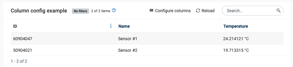
Example of a default filterable column.
If you need to create a custom filter because your column contains any other data format (e.g. Boolean, Date, etc.) you need to create a new custom filter view and use the filteringFormRendererComponent attribute to bind it to the column.
The sortable and sortOrder properties
As opposed to the filter button, the sort button will be shown by default, even if sortable was not specified and its value is null or undefined on the column. That means here, that setting sortable only has an effect if it is being set to false to explicitly state that a column should not be sortable.
If the user clicks on the sort button of a column, the sortOrder attribute will change to the current sort value. The grid can be sorted by multiple columns. sortOrder has three states: neutral (‘’), ascending (‘asc’), or descending (‘desc’).
Sizing, position, and visibility
The position of a column is implicitly set by its position in the columns array. If not set manually, the size of a column is calculated by the count of columns per row so that all columns have the same space available.
The c8y-data-grid offers a configuration where users can change the position/order of a column and can show or hide columns. Additionally, columns are resizable by default so it’s up to the user to decide how large a column should be. Using positionFixed or resizable attribute you can disallow the user to change this configuration.
If the content of a cell exceeds the width of the column, the overall height of that row will be increased also for all other columns of that row:

You can circumvent this increase in height by allowing a cell to have more space so that its content will not require multiple lines of text. The most direct way is to set the gridTrackSize attribute (to for example > 1fr) if you know that the content it displays is rather large. You can also indirectly influence the size of a column by assigning it a dataType. There you can choose between Icon/ Numeric/ TextShort and TextLong.
Wrapping it up

Are you still reading? Wow you are a dedicated person  . I know this chapter was a bit more on the theoretical side, but now you know all the relevant attributes that make up a well-configured table!
And with that being said, we can now go to the fun part - move on to chapter 3 where we will set up a c8y-data-grid using the remote-data approach.