Overview
The fifth chapter explains the topic selection handling in custom widgets.
This chapter is recommended for anyone planning to create or enrich a custom widget with data point selection that can be used to filter other widgets.
The basis for chapter five is a custom widget that uses the data assignment as it was explained and created in chapter three.
Widget Preview
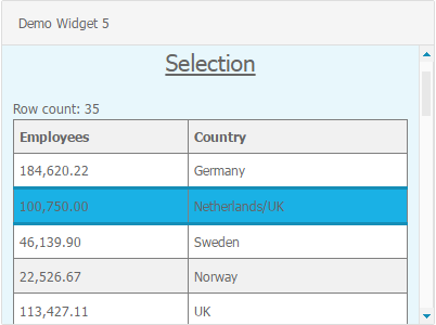
The custom widget “Demo widget 5” will display the data of columns and rows just like “Demo widget 3” and “Demo widget 4”, but additionally support the selection of data points.
The screenshots below show the final result of “Demo widget 5”.
Resulting files
Demo widget 5 consists of the following directories and files.
As compared to the structure of "Demo widget 4" the following folders and files were added or changed.
| \---customWidgets |
\---demoWidget5
| demoWidget5Config.js
| demoWidget5Module.js
|
+---assets
| +---css
| | widget_demoWidget5.less
| |
| \---images
| demoWidget5MenuIcon_32x32.png
|
+---js
| demoWidget5AssignDataCtrl.js
| demoWidget5Ctrl.js
| demoWidget5DataService.js
|
\---partials
| demoWidget5.html
|
\--- assignDataDialog
| advancedProperties.html
| assignColumns.html
| assignData.html
| thresholdProperties.html
|
\--- columnTypeConfigTemplates
date.html
numeric.html
text.html
|
The created files and source code accompanying this article can be downloaded here.
Creation steps
Step 1: Extend the custom widget view template to handle selections
In order to visualize and handle the selection of data points in the custom widgets the widget view must be adapted.
Therefore please edit the custom widget view template demoWidget5.html and adapt the html as follows:
| demoWidget5.html |
<!--This is the view template for Demo Widget 5-->
<div class="demoWidget5">
    <h3>Selection</h3>
    <div ng-show="columns.length == 0">No column was assigned.</div>
    <div ng-show="columns.length > 0">
        <div>Row count: {{rowCount}}</div>
        <table>
            <tr>
                <th ng-repeat="column in columns">
                    {{column.name}}
                </th>
            </tr>
            <tr ng-repeat="row in rows"
                class="rowEntry"
                ng-click="onRowClick(row)"
                ng-class="{'selected' : selectedRow === row}"
                ng-style="{'background-color' : getRowColor($index, row)}"
                >
                <td ng-repeat="column in columns">
...
                </td>
            </tr>
        </table>
    </div>
</div>
|
Explanation:
In Line #14 the CSS class "rowEntry" was added to the table row element. CSS style declarations for "rowEntry" will have an effect on the table row elements now.
In Line #15 the AngularJS directive ng-click was added to trigger the selection on mouse click and call the custom widget controller function "onRowClick(row)". For further explanations on the AngularJS directive ng-click please visit the AngularJS API Docs.
In Line #16 the AngularJS directive ng-class is used to add the CSS class "selected" to the table row element if the current row object of ng-repeat equals the scope variable "selectedRow". For further explanations on the AngularJS directive ng-class please visit the AngularJS API Docs.
Step 2: Extend the custom widget style
In order to use the CSS classes "rowEntry" and "selected" in the view template they need to be added to the widget styles.
Therefore please edit the file widget_demoWidget5.less and add the style declarations for the CSS classes "rowEntry" and "selected".
| widget_demoWidget5.less |
.panel-dashboard-default[widget-type='demoWidget5'] {
...
}
.demoWidget5 {
  width: 100%;
  height: 100%;
  overflow: auto;
  padding: 10px;
.rowEntry{

&.selected {

background-color: @brand-primary;

border: 1px solid @brand-primary;

border-width: 3px 1px 3px 1px;

}

&:hover {

background-color: lighten(@brand-primary, 10%);

border: 1px solid @brand-primary;

border-width: 3px 1px 3px 1px;

cursor: pointer;

}

}

…

}
|
Explanation: The CSS class ".rowEntry" starting in line #11 groups the styles for selection and mouse over of table rows in the custom widget. The selection is defined in the CSS class "selected" and sets the background to brand-primary-blue. The :hover selector selects rowEntries on mouse over and colors the background in a lighter brand-primary-blue and turns the cursor into a pointer. Both styles also modify the border drawn around a row.
Step 3: Extend the custom widget controller to handle selections
In order to handle the selection state of the custom widget and inform the other components about the selection, the custom widget controller needs to be extended.
Edit the file demoWidget5Ctrl.js and add the following services and functions.
| demoWidget5Ctrl.js |
angular.module('demoWidget5Module')
<span style="color:#0000FF;">/**
* Controller for the custom widget
* The controller provides the widget variables and manages the interactions between data-model and view
*/</span>
.controller(<span style="color:#008000;">'demoWidget5Ctrl'</span>,[<span style="color:#008000;">'$scope'</span>,<span style="color:#008000;">'formatDateService','formatNumberService'</span>,<span style="color:#008000;">'thresholdConstants'</span>,<span style="color:#008000;">'thresholdService'</span>,<span style="color:#008000;">'filterService'</span>,
<span style="color:#B22222;"> function</span>($scope, formatDateService, formatNumberService, thresholdConstants, thresholdService, filterService){
…
//The column-index-map is used to map the column names onto the original column indices of the feed result
var columnIndexMap = {};
//$scope.selectedRow holds the selected row
$scope.selectedRow = undefined;
…
/**
* This function adds all configured columns to a scope variable configuredColumns
* that can be used by the custom widget view to access the column configuration
* This function also creates a column-index-map to determine the index of a column by its name.
* @param data The data for the assigned and server-requested data source columns
*/
var createConfiguredColumns = function(data) {
for (var i = 0; i < data.columns.length; i++) {
var configuredColumn = getConfiguredColumnByName(data.columns[i].name);
var columnName = data.columns[i].name;
if(configuredColumn != undefined){
$scope.configuredColumns[columnName] = configuredColumn;
columnIndexMap[columnName] = i;
$scope.columns.push(data.columns[i]);
}
}
};
…
/**
* This function checks if the current feed result contains the selected value
* If no matching selection value was found the widget selection will be removed
* @param data The data for the assigned and server-requested data source columns (feed result)
*/
var checkSelection = function(data){
var found = false;
for(var i = 0; i < data.rows.length; i++){
var row = data.rows[i];
if(!row.values || row.values.length < 1){
continue;
}
var val = row.values[0];
if(val === $scope.selectedRow) {
found = true;
break;
}
}
if(!found) {
filterService.onSelectionChange($scope.item.identifier, , );
$scope.selectedRow = undefined;
}
};
<span style="color:#0000FF;"> /**
* This helper function returns the value for a certain column in a given row
* @param row The row object
* @param colName The name of the column
* @returns The value of the row column or undefined if the row has no data
*/</span>
<span style="color:#B22222;"> var </span>getCellValue = <span style="color:#B22222;">function</span>(row, colName){
<span style="color:#B22222;">if</span>(!row || !row.values){
<span style="color:#B22222;"> return</span> undefined;
}
return row.values[columnIndexMap[colName]];
};
<span style="color:#0000FF;"> /**
* This helper function collects column names and column values for a given row
* and fills the given arrays columnNames and columnValues with the collected data
* @param row The given row
* @param ioColumnNames The given array for collected column names
* @param ioColumnValues The given array for collected column values
*/</span>
<span style="color:#B22222;"> var</span> fillRowDataArrays = <span style="color:#B22222;">function</span>(row, ioColumnNames, ioColumnValues){
<span style="color:#B22222;">if</span>(row === undefined){
<span style="color:#B22222;">return</span>;
}
for(<span style="color:#B22222;">var</span> i=0; i < $scope.columns.length; i++){
<span style="color:#B22222;">var </span>configuredColumnName = $scope.configuredColumns[$scope.columns[i].name].newName;
ioColumnNames.push(configuredColumnName);
ioColumnValues.push(getCellValue(row, configuredColumnName));
}
};
<span style="color:#0000FF;"> /**
* This function informs the framework about selection changes
* @param row The selected row
*/</span>
<span style="color:#B22222;"> var</span> handleRowSelection = function(row) {
$scope.selectedRow = row;
<span style="color:#B22222;"> var</span> columnNames = [];
<span style="color:#B22222;"> var</span> columnValues = [];
fillRowDataArrays(row, columnNames, columnValues);
filterService.onSelectionChange($scope.item.identifier, columnNames, columnValues, $scope.cardIdentifier);
};
<span style="color:#0000FF;"> /**
* This function is called when the user selects a row in the custom widget
* @param row The selected row
*/</span>
$scope.onRowClick = <span style="color:#B22222;">function</span>(row) {
handleRowSelection(row);
};
…
/**
* This function is called from the custom widget framework when the requested data from the server returns
* @param data The data for the assigned and server-requested data source columns (feed result)
*/
$scope.setData = function(feedResult){
createScopeVariables(feedResult);
createConfiguredColumns(feedResult);
createThresholds(feedResult);
checkSelection(feedResult);
};
…
initWidget();
}
]);
|
Explanation:
In line #7 and #8 the service "filterService" is added to the controller. This service is used to inform the filter framework and thereby other widgets about selection changes in this widget.
In line #12the map object "columnIndexMap" is created. This object will be used to map the column names onto the original column indices of the feed result.
In line #14 the scope variable "selectedRow" is declared. It is used to store the selected row in the controller and make it available for the view template.
The function "createConfiguredColumns()" starting in line #23 was extended to fill the object "columnIndexMap" with data.
The function "checkSelection()" starting in line #41 checks if the selection data matches the widget data and if not removes the selection. It is called on any data update in the function "setData(feedResult)" in line #120.
The helper functions "getCellValue()", starting in line #66, and "fillRowDataArrays()", starting in line #80, are used to collect the selection data.
The function "handleRowSelection()", starting in line #95, updates the $scope variable and informs the "filterService" about selection changes.
The scope function "onRowClick(row)", starting in line #107, handles the selection triggered by the user.
Intermediate status:
Step 4: Enable URL selections
Up until this point the custom widgets supports user selections triggered through mouse events. But it is also possible to set a selection via URL.
The URL selection controls will be enabled by adding a new action to the custom widget configuration.
Therefore please edit the custom widget configuration file demoWidget5Config.js and add the action "preselection" as shown in the example below.
| demoWidget5Config.js |
angular.module('demoWidget5Module')
    /**
     * Configuration for the custom widget
     * The config contains all configurable properties of the widget
     */
    .config(['dashboardProviderProvider','columnTypeConfigUrlServiceProvider',
        function (dashboardProviderProvider, columnTypeConfigUrlServiceProvider) {
            dashboardProviderProvider.widget('demoWidget5', {
                title: 'Demo Widget 5',
...
                actions: [
...
                    'preselection',
...
                ],
...
|
Explanation: The action "preselection" enables the tab "URL Selection" in the widget properties menu as shown in the screenshot below.
Hint: In order to trigger an URL selection the dashboard URL must be enriched with the URL selection parameters. These are provided in the URL selection tab of the widget properties menu and can be easily copied to the clipboard.
Step 5: Extend the custom widget controller to handle URL selections
Now the custom widget controller must be extended to receive and process the URL selections.
Therefore please edit the file demoWidget5Ctrl.js again and add the following function.
| demoWidget5Ctrl.js |
angular.module('demoWidget5Module')
<span style="color:#0000FF;">/**
 * Controller for the custom widget
 * The controller provides the widget variables and manages the interactions between data-model and view
 */</span>
.controller(<span style="color:#008000;">'demoWidget5Ctrl'</span>,[<span style="color:#008000;">'$scope'</span>,<span style="color:#008000;">'formatDateService','formatNumberService'</span>,<span style="color:#008000;">'thresholdConstants'</span>,<span style="color:#008000;">'thresholdService'</span>,<span style="color:#008000;">'filterService'</span>,
    <span style="color:#B22222;">function</span>($scope, formatDateService, formatNumberService, thresholdConstants, thresholdService, filterService){

…

/**

* This function is called from the widget framework to set a selection in the custom widget

* It searches all custom widget rows to find one matching the given selection parameters

* @param cols A list of all the columns in selection

* @param values A list of the values selected corresponding to cols

*/

$scope.setSelection = function(cols, values) {

if(!cols || !values || cols.length !== values.length) {

 return;

}

 var matchingRow = undefined;

//loop through all the rows

if(cols.length > 0) {

 if($scope.rows) {

 for (var i = 0; i < $scope.rows.length; i++) {

  var rowUnderInspection = $scope.rows[i];

 var matchingRowFound = true;

//loop through all columns that are in selection

 for (var j = 0; j < cols.length; j++) {

 var columnName = cols[j],

columnIndex = columnIndexMap[columnName];

 //if any mismatch is found, consider it as false and break

//check for valid column first

if (columnIndex === undefined){

matchingRowFound = false;

 break;

}

 var rowValue = rowUnderInspection.values[columnIndex];

 var selectedValue = values[j];

 //parse numeric columns values

 var configuredColumnType = $scope.configuredColumns[columnName].type;

if(configuredColumnType === ‘NUMERIC’){

rowValue = parseFloat(rowUnderInspection.values[columnIndex]);

selectedValue = parseFloat(values[j]);

}

 if(rowValue !== selectedValue) {

matchingRowFound = false;

break;

}

}

 if (matchingRowFound) {

matchingRow = rowUnderInspection;

 break;

}

}

}

}

                //select the matching row

handleRowSelection(matchingRow);

};

…

initWidget();

}

]);
|
Explanation: The function "setSelection(cols, values)" starting in line #17 is called from the widget framework in order to set a selection in the custom widget. It loops through all columns involved in the selection and compares the custom widget row values with the given selection values to find a matching record.
Example: When getting selection parameters: cols = ['Country'] and values = ['Germany'] the function will select the row containing the value "Germany" for column "Country". If no matching row was found the selection will be removed.
Step 6: How to clear a selection manually
In order to manually remove a selection the widget framework provides an action "Clear selection" in the widget menu. This action can be activated by adding the view mode action "deleteSelection" to the custom widget configuration.
Therefore please edit the file "demoWidget5Config.js" again and add the array "viewModeActions" with the entry "deleteSelection".
| demoWidget5Config.js |
angular.module('demoWidget5Module')
    /**
     * Configuration for the custom widget
     * The config contains all configurable properties of the widget
     */
    .config(['dashboardProviderProvider','columnTypeConfigUrlServiceProvider',
        function (dashboardProviderProvider, columnTypeConfigUrlServiceProvider) {
            dashboardProviderProvider.widget('demoWidget5', {
                title: 'Demo Widget 5',
...
                viewModeActions: ['deleteSelection'],
...
            });
...
|
Explanation: The array "viewModeActions" in line #13 holds all actions that are to be shows in the custom widget menu, in view mode. After adding the action "deleteSelection", the menu will show the button "Clear selection". Clicking that button will inform the custom widget that the selection is to be removed.
The logic to clear the selection is to be implemented in the custom widget controller.
Please edit the file demoWidget5Ctrl.js again and add the following event listener.
| demoWidget5Ctrl.js |
angular.module('demoWidget5Module')
<span style="color:#0000FF;">/**
 * Controller for the custom widget
 * The controller provides the widget variables and manages the interactions between data-model and view
 */</span>
.controller(<span style="color:#008000;">'demoWidget5Ctrl'</span>,[<span style="color:#008000;">'$scope'</span>,<span style="color:#008000;">'formatDateService','formatNumberService'</span>,<span style="color:#008000;">'thresholdConstants'</span>,<span style="color:#008000;">'thresholdService'</span>,<span style="color:#008000;">'filterService'</span>,
    <span style="color:#B22222;">function(</span>$scope, formatDateService, formatNumberService, thresholdConstants, thresholdService, filterService){

…

/**

* This helper function informs the framework about selection changes

* @param row The selected row

*/

var handleRowSelection = function(row) {

$scope.selectedRow = row;

 var columnNames = ;

var columnValues = ;

fillSelectionArray(row, columnNames, columnValues);

filterService.onSelectionChange($scope.item.identifier, columnNames, columnValues, $scope.cardIdentifier);

};
…

/**

* This event listener is called from the custom widget framework when the user clicks on “Clear selection” in the widget menu

* The event listener function clears the selection in the custom widget

*/

$scope.$on(“onDeleteSelection”, function(){

handleRowSelection();

});
…

initWidget();

}

]);
|
Explanation: When a user presses the "Clear selection" button in the widget menu, an event will be created and propagated. In order to receive this event, an event listener needs to be added to the custom widget controller. In line #28 the AngularJS scope method "$on(name, listener)" is used to attach such an event listener for "onDeleteSelection"-events. Whenever the event occurs the function "handleRowSelection()" is called. Calling "handleRowSelection()" without parameters will remove the custom widget selection.
Hint: For further explanations on AngularJS scope methods and event handling please visit the AngularJS API Docs.
Intermediate status:

The custom widget can handle user and URL selections and deselections by now.
Step 7: Extend the custom widget config and data service to provide widget coordinates
Up until now, setting a selection in the custom widget only has a visual effect and highlights a certain data point (row). But in order to use the selected data point to influence other widgets, for example to apply a filter, the data service needs to be involved.
Please edit the custom widget configuration file demoWidget5Config.js and extend the widget interface as shown in the code example below.
| demoWidget5Config.js |
angular.module('demoWidget5Module')
    /**
     * Configuration for the custom widget
     * The config contains all configurable properties of the widget
     */
    .config(['dashboardProviderProvider','columnTypeConfigUrlServiceProvider',
        function (dashboardProviderProvider, columnTypeConfigUrlServiceProvider) {
            dashboardProviderProvider.widget('demoWidget5', {
                title: 'Demo Widget 5',
...
                resolve: {
                    widgetInterface: function(config, demoWidget5DataService) {
                        config.widgetInterface = {
                            getDataMapping: demoWidget5DataService.getDataMapping,
                            calculateCoordinateList: demoWidget5DataService.calculateCoordinateList
                        };
                    }
                },
...
|
Explanation: In line #17 the widget interface function "calculateCoordinateList" gets activated. It will be implemented in the custom widget data service and collects all coordinates (columns) provided by this custom widget. By implementing this interface function, the custom widget informs the widget framework about available coordinates (columns) that can be used for example to define filter dependencies between widgets..
The implementation needs to be added to the data service.
Therefore please edit the file demoWidget5DataService.js and add the function "calculateCoordinateList(config)".
| demoWidget5DataService.js |
angular.module('demoWidget5Module')
<span style="color:#0000FF;">/**
* Data service for the custom widget
* The data service defines the data mapping - the structure of the data delivered by the server
*/</span>
.service(<span style="color:#008000;">'demoWidget5DataService'</span>,[<span style="color:#008000;">'widgetDataService'</span>,<span style="color:#008000;">'formatNumberService'</span>,<span style="color:#008000;">'typeconstants'</span>,
function(widgetDataService,formatNumberService,typeconstants) {
…
return {
getDataMapping : <span style="color:#B22222;">function</span>(item) {
…
},
<span style="color:#0000FF;">/**
* This function collects all coordinates (columns) provided by this custom widget.
* @param config The custom widget configuration
* @returns The coordinates provided by the custom widget
*/</span>
calculateCoordinateList : <span style="color:#B22222;">function</span>(config) {
<span style="color:#B22222;">var </span>list = [];
<span style="color:#B22222;"> if</span>(config.assignedColumns && config.assignedColumns.numDataColumn){
list.push({
<span style="color:#008000;">'name'</span>: config.assignedColumns.numDataColumn.newName,
<span style="color:#008000;">'type'</span>: config.assignedColumns.numDataColumn.type
});
}
<span style="color:#B22222;"> if</span>(config.assignedColumns && config.assignedColumns.textDataColumn){
list.push({
<span style="color:#008000;">'name'</span>: config.assignedColumns.textDataColumn.newName,
<span style="color:#008000;">'type'</span>: config.assignedColumns.textDataColumn.type
});
}
<span style="color:#B22222;">if</span>(config.assignedColumns && config.assignedColumns.dateDataColumn){
list.push({
<span style="color:#008000;">'name'</span>: config.assignedColumns.dateDataColumn.newName,
<span style="color:#008000;">'type'</span>: config.assignedColumns.dateDataColumn.type
});
}
<span style="color:#B22222;"> if</span>(config.assignedColumns && config.assignedColumns.furtherColumns){
<span style="color:#B22222;">for</span>(<span style="color:#B22222;">var</span> i = 0; i < config.assignedColumns.furtherColumns.length; i++){
<span style="color:#B22222;"> var</span> column = config.assignedColumns.furtherColumns[i];
list.push({
<span style="color:#008000;">'name'</span>: config.assignedColumns.furtherColumns[i].newName,
<span style="color:#008000;"> 'type'</span>: config.assignedColumns.furtherColumns[i].type
});
}
}
<span style="color:#B22222;">return</span> list;
}
};
}
]);</code></pre>
|
Explanation: The function "calculateCoordinateList(config)", starting in line #22, creates an array containing objects with column name and column type of configured columns. The coordinate list defines the columns that can be involved in for example filter dependencies with other widgets.
In the screenshot below the custom widget "Demo Widget 5" is used in the filter dialog. It provides all configured columns as "Available coordinates" for setting up a filter condition. In this case a column chart will be filtered depending on the selection in "Demo Widget 5".
Summary and sources
As a final result of chapter five, the custom widget supports the manual and URL based selection and deselection of data points (rows). It provides all configured columns as filter coordinates and can, therefore, be used to filter other widgets.
The source code for "Demo Widget 5" can be downloaded here.
Read in this series:


